MortonCoverClear.png

MortonArboretum

BRANDING FOR PUBLIC GARDEN AND OUTDOOR MUSEUM

The logo is comprised of simple shapes that evoke the scientific background of the Arboretum while still accomplishing the serenity that can be felt while visiting. Accompanied by earth tone colors and a bespoke serif font, the logo speaks to the nature that can be experienced at the Arboretum.

The basis of the poster is to encourage the idea that the Morton Arboretum is an escape from the stress of the everyday. Seeing the beauty that can be made by simply looking up at the trees will entice people to come and visit.

The use of a beautiful hiking photo allows the recipient of this mailer advertisement to truly see themselves in the environment of the Arboretum. The simplicity of the design solidifies the fact that the relationship humans’ have with nature is simple, honest, and pure.

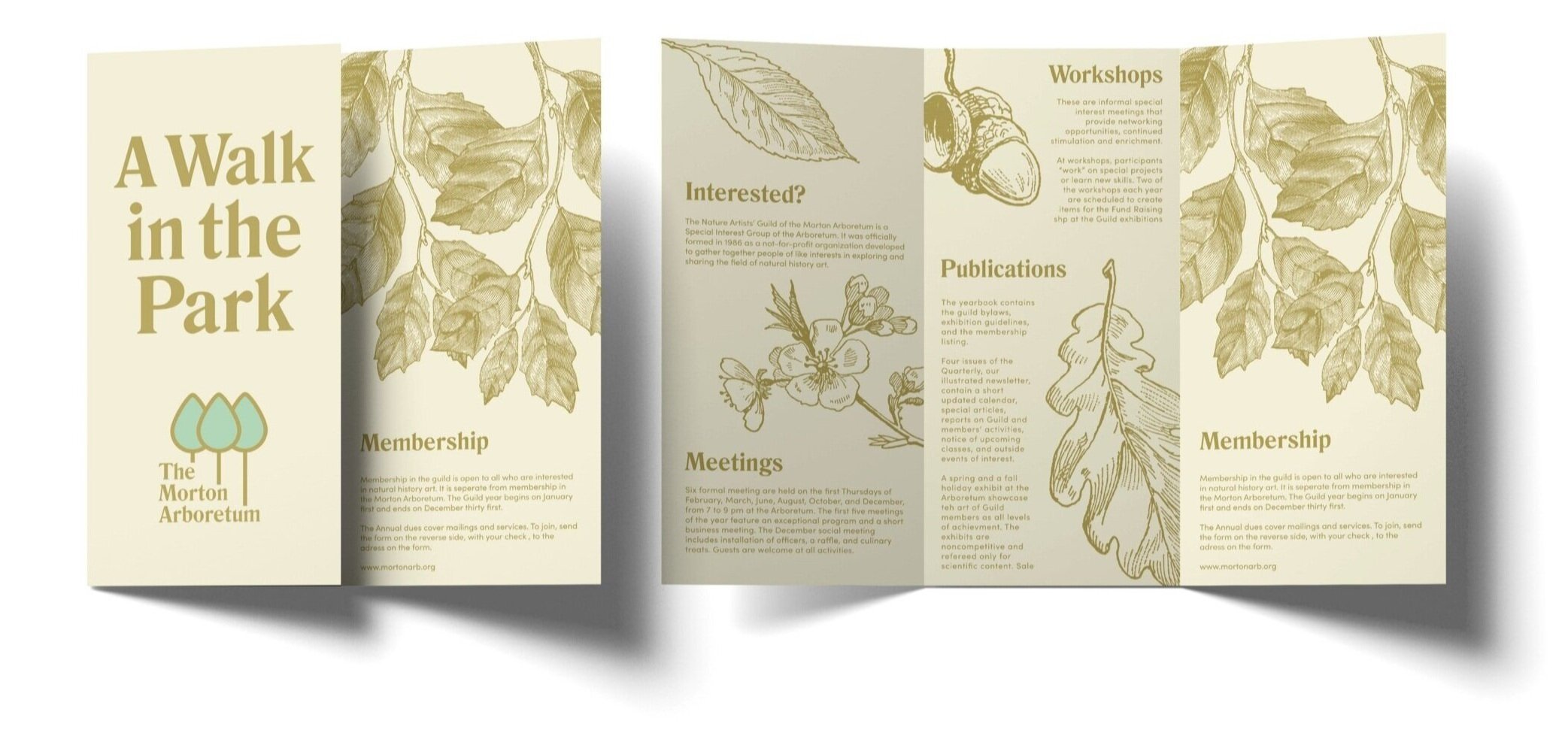
This simple trifold pamphlet emphasizes the nature that can be found in the Arboretum. Constructed out of recycled materials and using earth tones, it will fit in perfectly while on an adventure through the woods.